March 5, 2013
Logo Boxes Take Two – Readability

Last month’s post deserves a quick follow up. In an older post, we stated that you should be careful that your customer does not place too many words on their sign. A verbose sign plus a difficult-to-read font is a recipe for ineffectiveness.
This is where logo boxes can come to the rescue. If your customer insists on having more than 4 words on their channel letters sign, ask them to use a logo box instead of placing all wording in the primary sign area. Recommend a main sign + logo box combination – your customer will be better off for it.
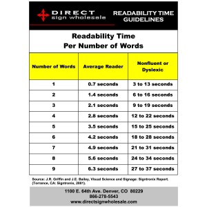
Remember this chart?

It shows the problem associated with too many sign words – the reading time length. This is particularly true if the sign is meant to be read by someone in a moving vehicle. Remember that logo boxes do not always contain a logo (despite their nickname.) They may also contain a positioning or branding statement – which can reduce the “primary area” sign words. For example, check out this logo box (again, click for a larger image.)

Note the primary image is the company logo. But it also carries the secondary message of “infinite possibilities” (this is actually a pizza restaurant, and they make infinite topping combinations. That is the source of the slogan.)
Remember that a verbose sign can sometimes mean that a viewer will only read part of it – and that lack of sign message comprehension can mean the difference between a sale or no sale. People will not make a special effort to read a sign if it has too many words or is difficult to read (due to a scripted font or poor color contrast, for example.)

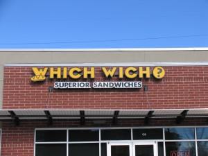
The point is that many signs have both a primary and a secondary message. The primary message should always get top billing in the primary sign area (as “Which Wich” does in the channel letter sign above.) If that primary area does not offer sufficient real estate for the number of words your customer wants, a logo box can be an excellent solution for the secondary message. A backer board with lettering is another option that may be helpful.
So if your customer says the sign MUST have the additional words, place the extra words on a logo box and let the sign’s primary message shine – by keeping it first and foremost. This is an excellent solution for a customer who insists on having more than four words on their sign.
