January 18, 2024
Which Colors Are Best for Restaurant Signage?
As an essential aspect of overall branding and customer attraction strategy, restaurant signage and design goes beyond merely indicating the restaurant’s location. It’s the first impression potential customers get of an establishment, conveying the brand’s personality and the type of dining experience they can expect.
In our role as a sign wholesaler, we often receive inquiries from retailers about the best color choices for their clients’ restaurant signage. This tends to be a critical decision, as the color of a restaurant sign can significantly impact how customers perceive one’s business and their attraction to the establishment as a whole. For fast or casual dining, certain colors can enhance the signage effectiveness, stimulating appetite and conveying speed and efficiency.
In this blog, we will explore recommendations for the most effective color choices on both indoor and outdoor restaurant signage and the importance of cohesive branding.
Color Psychology in Business
When it comes to choosing what color is going to represent one’s business, there is so much more than just the act of selecting a color. There’s an entire psychology around it. Warm colors such as red, orange, and yellow are often recommended as they are not only eye-catching, especially from a distance, but they also have been known to stimulate appetite. Some restaurants might even opt for cooler colors like blues and greens if they align better with their brand identity. As such, it’s crucial to not only consider the psychology behind restaurant signage, but also its critical role in reflecting and reinforcing the overall branding and theme of the restaurant.
The Color Red in Restaurant Signage
The color red is often favored for restaurant signage as it stimulates excitement and hunger, making it effective in attracting customers and being noticeable from afar. Additionally, red incites strong reactions akin to ‘sale’ signs in stores, and has an attention-halting power similar to stop signs. Its perceived closeness also amplifies its capacity to grab attention.
McDonalds
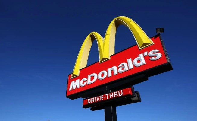
The psychology of the color red is certainly not lost amongst the larger fast or casual restaurant chains, including McDonalds, whose arches logo is known for bright yellow, but also utilizes red in their overall branding colors. Channel letters with red faces can be an effective color choice for other business types that are active at night as well, such as liquor stores, bars or convenience stores.
The Color Pink in Restaurant Signage
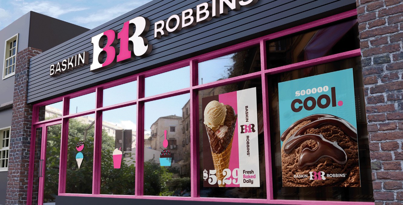
Pink, often associated with femininity, sensitivity, tenderness, and romance, is a softer version of red with unique implications in color psychology. It’s an excellent choice for restaurant signage aiming to project a soft, welcoming, or romantic atmosphere. Depending on the shade, pink can be attention-grabbing, making it effective for signs. For instance, it’s used by establishments like Baskin Robbins, the ice cream chain, to evoke sweetness and indulgence alongside brown or white, their other primary colors.
Baskin Robbins
Recently, Baskin Robbins went through a rebrand, throwing back to their original colors – pink (representing cherry) and brown (representing chocolate). Like all color choices, it’s important to consider whether the colors selected align with the overall brand identity and theme of the establishment.
The Color Yellow in Restaurant Signage
The color yellow has been known to stimulate mental processes and encourage communication. It’s also often associated with happiness, optimism, and cheerfulness. When it comes to restaurant signage, yellow can be quite effective as it is highly visible and attention-grabbing, even from a distance. It can help to create a welcoming and joyful atmosphere, making it a good choice for fast or casual dining establishments.
Again, McDonald’s uses both red and yellow in their restaurant signage. While red is thought to stimulate appetite and draw attention, yellow evokes feelings of happiness and comfort. The combination is not only eye-catching but also aligns with their branding strategy of providing quick, satisfying meals in a friendly environment.
The Color Orange in Restaurant Signage
Selecting orange for restaurant signage capitalizes on its psychological and visual impact, stimulating appetite and creating a vibrant, welcoming atmosphere. It’s ideal for engaging customers positively with its visibility and attention-grabbing qualities. The color’s associations with friendliness and creativity further enhance the dining experience. Complementary color pairings can boost visual appeal, particularly for culinary-themed establishments with a citrus twist. Ultimately, strategic use of the color orange can convey energy, friendliness, and innovation, contributing to the restaurant’s overall identity.
Dunkin’ Donuts
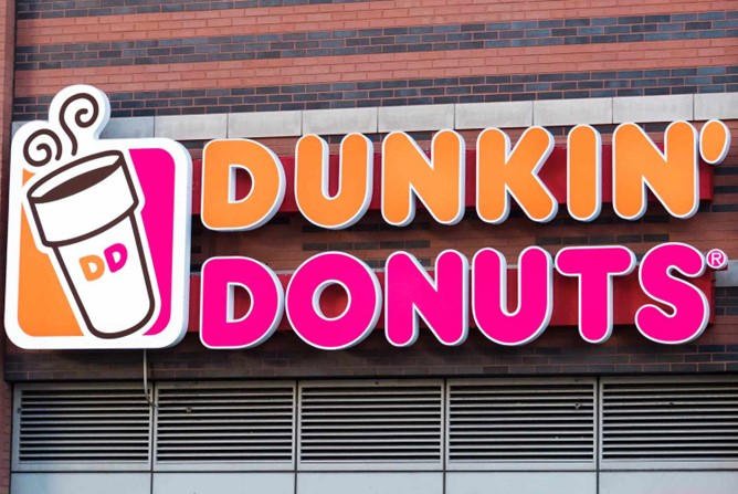
Dunkin’ Donuts is a notable example of how this color can be used effectively in restaurant signage. The brand’s iconic logo prominently features orange lettering against a pink background. The choice of orange complements the energetic and vibrant nature of the brand, creating a welcoming and friendly atmosphere for customers. The color also aligns with the warm and comforting associations of coffee, a central offering at Dunkin’ Donuts.
The Color Blue in Restaurant Signage
Blue, a versatile color with psychological and cultural associations, can be strategically used in restaurant signage. Often linked to calmness and trust, it’s suitable for establishments aiming for a peaceful ambiance or professionalism. While not as appetite-stimulating as warmer colors, lighter shades of blue can evoke freshness and coolness, suitable for cafes or juice bars. Its versatility in pairing with other hues offers creative and aesthetically pleasing design options. The specific shade of blue used should align with the restaurant’s overall theme, cuisine, and branding goals, as blue can convey tranquility, trustworthiness, or a refreshing atmosphere.
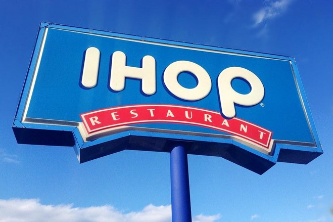
IHOP (International House of Pancakes)
A great example of the effective use of the color blue in restaurant branding is found in the international chain, IHOP (International House of Pancakes). IHOP incorporates shades of blue in its logo, interior design, and signage. The use of blue contributes to a calming and inviting atmosphere, and complements the family-friendly and casual dining image that IHOP aims to convey.
The Color Green in Restaurant Signage
Green’s varied psychological and cultural implications make it effective for restaurant signage design. Associated with nature, growth, and freshness, it’s favored by venues promoting organic or plant-based menus. Green fosters a soothing, eco-friendly environment and enhances the dining experience with its link to positive emotions like balance and tranquility. Culturally, green signifies luck, fertility, and prosperity, communicating a health-conscious, nature-connected ethos in restaurant signage, appealing to customers seeking a fresh dining experience.
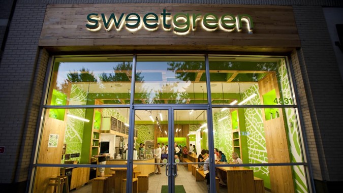
Sweetgreen
Sweetgreen, the national salad chain, uses a green color scheme, indicating their focus on fresh, healthy, and plant-based options. The green color helps create a calming atmosphere in their restaurants and communicates their commitment to sustainability and wellness.
The Color Purple in Restaurant Signage
The color purple, often associated with luxury, power, and ambition, carries significant psychological implications. It’s linked to creativity and imagination, adding a sense of mystery and magic. Frequently used in branding to evoke luxury and exclusivity, purple can create a sophisticated and elegant atmosphere in a restaurant setting, often associated with spiritual fulfillment and calmness.
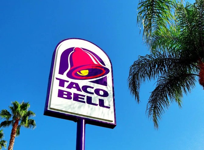
Taco Bell
Historically connected to royalty and nobility due to its rarity, purple can also suggest artificiality if overused. Therefore, careful balance in its usage can effectively influence customer perceptions. For instance, Taco Bell, the fast-food chain, incorporates purple in their logo and branding, conveying a sense of uniqueness and creativity that aligns with their innovative approach to fast food.
The Color Black in Restaurant Signage
The color black, often associated with power, elegance, formality, and mystery, symbolizes strength and authority. It’s frequently used in branding to project sophistication and exclusivity, and in a restaurant setting, it can create a stylish and modern atmosphere. However, since black is also linked to mourning and death in many cultures, its application requires careful thought to avoid negative connotations. Black’s versatility allows for effective pairing with other colors and can symbolize a minimalist aesthetic in design.
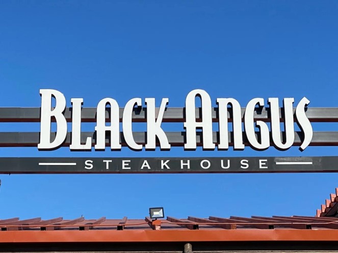
Black Angus Steakhouse
Black Angus Steakhouse serves as an excellent example of the strategic use of the color black in restaurant signage. Their black-and-white signage not only stands out but also effectively communicates the brand’s identity. The deep, bold black hue in their logo mirrors the richness and robust flavors of their steaks, while the contrasting white suggests cleanliness and precision in their culinary practices.
The Color Brown in Restaurant Signage
Brown, often associated with reliability, stability, and honesty, signifies earthiness, nature, and simplicity. This makes it popular in branding for products or services related to the outdoors or organic offerings. In a restaurant context, brown can foster a warm, cozy, and comfortable atmosphere, enhancing the dining experience.
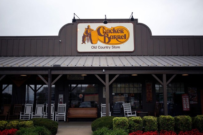
Cracker Barrel
An example of using brown effectively in restaurant signage is Cracker Barrel. The brown hues in their signage paired with yellow evoke a sense of homeliness, comfort, and a connection to nature. This aligns with their comfort food offerings and rustic decor. However, an overuse of brown can create a drab atmosphere, so it’s often balanced with other colors.
The Color White in Restaurant Signage
As a color that signifies a fresh start or innocence, white is often used to portray purity, cleanliness, and simplicity. In a restaurant setting, white can create a minimalist, clean, and bright atmosphere, enhancing the dining experience. White can also symbolize precision and perfection and be used in the design of modern or high-end restaurants to evoke a sense of sophistication and elegance.
As mentioned before, Black Angus Steakhouse uses white against a black background in their signage to portray a clean, yet sophisticated and elegant atmosphere. However, excessive use of white can sometimes lead to a sterile and cold atmosphere, so it’s often balanced with other colors or textures.
High-Quality Channel Letter Signs For Your Clients
Direct Sign Wholesale (DSW) plays a pivotal role in assisting sign retailers to deliver superior channel letter signs for their restaurant clients. As a top national provider, DSW leverages its expertise and resources to create durable and appealing restaurant signs that will boost your clients’ branding and business. With a wide variety of customizable options such as sizes, fonts, colors, and lighting, DSW provides guidance on signage etiquette and color selection, ensuring high impact and compliance with local regulations. Offering one of the industry’s broadest ranges of channel letter types, DSW promises efficiency with a production time of just 10-15 days and cost-effectiveness, offering an average saving of 20% compared to self-manufacturing.
When you partner with DSW, our number one goal is to provide a high quality letter product and exceptional service so you can deliver your customers a premium experience. DSW’s technology, lean manufacturing practices, and dedication to process, protection, and documentation ensure that your restaurant channel letter projects are completed and shipped on schedule.
Request a quote today to see how Direct Sign Wholesale can assist you in your project needs.
