May 31, 2024
Color Psychology & Outdoor Business Signs: White

White channel letters are a popular choice for businesses for a reason. They offer a clean, modern aesthetic that creates a striking first impression. Whether your client is a new startup or a well-established brand, white channel letters can greatly impact their storefront, grabbing the attention of potential customers.
However, before you help them make their final decision, it’s important for you to understand both the benefits and drawbacks of using white in their signage. Let Direct Sign Wholesale be your guide – not just in creating impactful signage for your clients, but also in understanding color psychology and its role in effective marketing.
Psychology of Color For White Channel Letter Signs
The color chosen for an outdoor business sign sends a subconscious message to potential customers. Understanding white color psychology can be a powerful tool for attracting attention and creating a positive brand image.
- Purity and Cleanliness: White is universally associated with cleanliness, innocence, and a fresh start. This makes it a great choice for businesses that want to project a sense of professionalism and trust, like medical facilities, spas, or high-end retailers.
- Modernity and Minimalism: White is a trendy color in design, symbolizing a sleek and modern aesthetic. This can be a great way to make your business appear cutting-edge and up-to-date.
- Versatility: White pairs beautifully with any other color, making it a great base for incorporating your brand’s specific colors. In addition to white, you can use colorful accents or logos to make your sign stand out even more.
Leveraging the Power of White in Channel Letter Signs
Leveraging white’s natural brightness can maximize the impact of a channel letter sign. Because white reflects the most light of any color, your sign will be highly visible, especially at night when illuminated by LED lighting. This ensures your business gets noticed from afar. Additionally, strategic color placement can further enhance this effect. A contrasting background, like a dark brick façade, will make your white letters really “pop” and create a bold, eye-catching display.
Striking a Balance: What Colors to Use with White Channel Letters
White offers fantastic visibility and a modern aesthetic. But, to truly make a sign stand out, we recommend considering implementing color combinations. For maximum visual appeal, there needs to be a clear contrast between the white letters and the colored background. A stark difference grabs attention and ensures that the outdoor sign for business is easily readable.
This is especially important for accessibility. According to the World Health Organization, over 300 million people globally experience some form of color blindness, most commonly red-green or blue-yellow deficiencies. High contrast between the letters and background ensures your sign is visible to everyone.
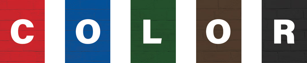
White on Red
Red is the color of excitement, passion, and urgency. Pairing it with the clean lines of white creates a bold and high-impact display, perfect for grabbing attention in fast-paced environments like restaurants or fast-food chains.
White on Blue
Blue evokes feelings of trust, security, and peace. This combination is calming and professional, making it a great choice for banks, financial institutions, or medical facilities. White lettering against a deep blue background creates a sense of authority and reliability.
White on Green
Green is associated with nature, growth, and freshness. This pairing creates a natural and inviting atmosphere, ideal for businesses like health food stores, garden centers, or eco-friendly companies. The white lettering pops against the green background, creating a clean and modern feel.
White on Brown
Brown represents stability, reliability, and comfort. This combination evokes a sense of warmth and tradition, making it a good choice for businesses like cafes, bookstores, or established brands. White lettering stands out well against brown backgrounds, offering excellent readability.
White on Black
Black is timeless, sophisticated, and luxurious. This classic combination creates a dramatic and bold statement, perfect for high-end retailers, jewelry stores, or nightclubs. White lettering against a black background offers the highest level of contrast for maximum visibility.
Utilizing contrast is crucial for impactful outdoor business signs. Take a look at the white channel letter sign mounted on a bright white building below. While both elements might be individually attractive, together they blend into a blurry mess. The message becomes lost because there’s no clear distinction between the letters and the background.
This is why choosing a contrasting background color for white channel letters is essential. A bold contrast grabs attention, makes the sign easily readable from afar, and ensures that your client’s brand message gets delivered loud and clear.
Related Article: Which Colors Are Best for Restaurant Signage?
What Colors Not to Use With White Channel Letters
While white boasts excellent contrast with many colors, there are a few combinations that make achieving strong daytime visibility can be tricky. Here’s a breakdown of how white interacts with some lighter façade colors:
Yellow:
Both white and yellow are bright and attention-grabbing colors on their own. However, when placed together, they can create a washed-out effect, especially in daylight. The subtle difference in value (lightness/darkness) between the two can make the white lettering appear faint and difficult to read.Orange:
Similar to yellow, orange can create a challenge for white channel letters in bright daylight. While the contrast might be slightly better than yellow, depending on the specific shade of orange, it’s still important to consider readability. If your heart is set on using orange, a darker, richer shade could offer a more readable contrast with white lettering.Beige:
Beige facades present a similar challenge to white and yellow. The beige background might be too close in value to the white letters, causing them to blend together and compromising readability. Opting for a white with a slightly cooler tone, like a crisp white with a hint of blue, can help create a subtle distinction against beige facades.
DSW Pro-Tip: If you are using white channel letters, and the background or facade which it is being mounted is a lighter color, you may want to consider adding a backer plate in a darker color that can both provide contrast, but also a unique look as it can be routed in different shapes and contours, as well as add to brand integrity. Additionally, you can help ensure that your white channel letters stand out during the day by including contrasting colored components like dark colored trim caps, returns, a border vinyl applied along the outside of the acrylic face, or even a full digital print that includes darker edges.
Which White Channel Letters Should I Choose?
White offers a sleek and modern aesthetic for channel letter signs, however, there’s ultimately a decision to be made: which shade of white is right for your client? Direct Sign Wholesale offers two popular options: Standard White (#7328) and Milky White (#2447).
- Standard White (#7328)
Standard white is the champion of nighttime visibility. Its bright, clean appearance boasts the highest level of reflectivity, ensuring your sign cuts through the darkness. This makes it ideal for outdoor business signs for restaurants, bars, or convenience stores that want to attract customers even after dark. Combine standard white with LED illumination of at least 6500 Kelvin (cool white), and that sign will light up the night, grabbing attention with its crisp and clear display. - Milky White (#2447)
Milky white offers a touch of subtlety compared to standard white. This shade has a slightly translucent quality, creating a softer and more diffused look. While its reflectivity is a touch lower than standard white, milky white still delivers excellent nighttime presence when illuminated with LEDs of 6500 Kelvin or higher (cool white color temperature). This combination creates a warm glow, perfect for businesses aiming for a more elegant or inviting nighttime aesthetic.
We Can Help You Find the Right Sign For Your Customer
White channel letters offer a modern and versatile option for outdoor business signage. By understanding the color psychology and marketing, and the impact of contrast, you can help your client create a sign that grabs attention and reflects their unique brand identity.
Direct Sign Wholesale’s expertise extends to both material and product selection, as well as color combinations. Whether you choose the bold impact of standard white for maximum nighttime visibility or the softer elegance of milky white, we can help you find the perfect shade for your client to achieve their desired effect.
Don’t hesitate to contact Direct Sign Wholesale today for a free quote and let us guide you towards the perfect white channel letter sign for your client’s business!