March 29, 2011
Which Sign Colors are Best for Older Adults?

Your client just said “our new business is targeted to older adults. So our sign needs to be easily legible to someone in that age group. What colors do you recommend?” What is your answer?
There is a difference in the way you should approach this project. Older adults have vision issues from aging. That impacts which colors you should use.
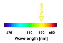
First, keep in mind that signage color combinations of blue and/or violet (and their derivative colors) are more difficult for older drivers to read. This applies to all signage types – not just channel letters. This is because the human eye has a decrease in visual sensitivity to shorter wavelength colors as it ages. As stated in Taylor’s book, “Combinations of colors that vary primarily in how much blue they contain create a great deal of difficulty for older drivers.”1
Blue and violet are lower wavelength, so the older adult has more trouble discerning them (see chart below.) Also, as a person ages the eye’s lens tend to focus on the middle and higher color wavelengths, such as yellow. Blue can be used as one color in the sign – but do not make the entire sign a mix of blue and/or blue derivatives. That is asking for trouble.
Another factor is that older adults’ eyes are slower to adapt to changing light conditions. That makes their eyes more sensitive to glare. Last, the older eye sees all colors as dimmer, so colors that are only moderately bright will be seen as dull.2
That also means a sign with a light background may be more difficult for an older adult to read due to the glare produced by the light background. Dark backgrounds are easier for the older eye to read against (sometimes you can’t control this – like when you are mounting a sign on a building with a light façade.)
Here are a few sign color combinations that would be more difficult for older adults to read:
• Green and Purple
• Turquoise and Green
• Blue and Gray
So what are the best sign color and font combinations if your client business is targeted to this group?
Play it straight and keep it simple. Here is a set of combination possibilities:
• Bright white on Black
• Bright yellow on Black
• Bright Yellow on Dark Blue
Like this:

White on Black2
For channel letters, a simple choice combination would be a yellow face on a black return. Another possibility is a white face on a dark blue return.

YellowonBlue2
The moral of the story is: a sign targeted to older adults is not the time to get overly creative with colors and fonts. Doing so will impact the sign’s effectiveness in a negative way.
1. “On-Premise Signs as Storefront Marketing Devices and Systems”, Charles R. Taylor, Thomas A. Claus and Susan L. Claus. Pg. 8-13.
2. Ibid, Pg. 8-13.
