September 20, 2024
Ineffective Advertising: The Impact of Low Quality & Poorly Designed Signage

An exterior business sign is the first thing potential customers see, and it can make or break their decision to visit a business. A well-designed and maintained sign can attract new customers, build brand recognition, and leave a lasting positive impact, while a lackluster one can drive them away.
In today’s competitive market, effective signage design is essential for business growth. Let’s explore how to transform your client’s sign from an ordinary business marker into an effective advertising tool.
Exterior Business Signage: A Means of Advertising
An outdoor business sign is prime real estate for advertising. Unlike traditional media, a business sign works 24/7, reaching a captive audience of passersby. It’s a cost-effective way to build brand awareness, generate foot traffic, and create a lasting impression.
A well-placed, eye-catching sign can transform a business into a local landmark, driving sales and outshining competitors.
Related Article: 10 Reasons To Invest in Outdoor Business Signs
What Is Low-Quality Signage?
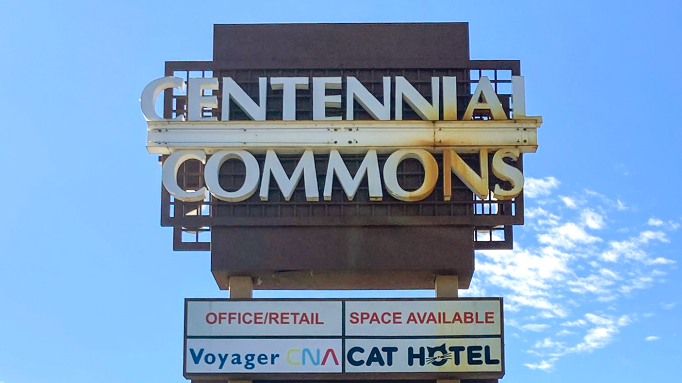
When it comes to outdoor signage for businesses, visually defective or low-quality signs can manifest far beyond just the physical condition of the sign to include aspects of design and functionality. Often seen in channel letters that need repair, with poor lighting, faded colors, or damaged materials creating a negative impression on prospective customers. Additionally, low-quality channel letters or logo boxes can result from poor design choices, such as inappropriate letter size, colors, contrast, or fonts that are difficult to read at a glance leaving customers to overlook or disregard the business entirely.
Related Article: 9 Common Signage Mistakes
LET’S DELVE DEEPER INTO THE CHARACTERISTICS OF LOW-QUALITY SIGNAGE
Bad Lighting

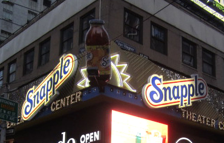
We’ve all seen illuminated signs at night that are missing areas of light or have unlit letters altogether. Though what they spell out can be humorous at times, more often than not just appears unprofessional. This includes letters or logo boxes showing hotspots, fading, flickering, banding, or burnt-out LED lighting, neon tubing, or bulbs. This inconsistency can create a jarring visual effect, especially in low-light or nighttime conditions. When some letters are lit while others are not, it can hinder the sign’s effectiveness as an outdoor advertising tool.
Letter Faces
Similar to bad lighting, cracked, faded, or peeling digital prints or vinyl, as well as damaged or missing acrylic faces, can leave an unfavorable impression on customers. Consistency is key in signage; a uniform and maintained appearance conveys professionalism and enhances the overall impact of exterior business signage for new and existing customers.
Structural Build
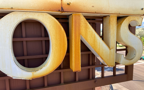
 Broken letters can give the impression of neglect or even financial instability, and can significantly damage a business’s image, as well as undermine the effectiveness of outdoor signage. Replacing broken letters promptly is essential to maintain a positive and professional image that attracts potential customers. Additionally, signs with rusting metal components, peeling or flaking paint, loose or broken trim caps, or other signs of wear should be repaired or taken down and replaced to protect the businesses’ credibility.
Illegible Fonts
The font your client chooses for their exterior business sign is crucial. Illegible fonts can quickly turn potential customers away. Fonts that are too ornate, overly stylized, or simply too small can be difficult to read, even from a short distance. When people struggle to decipher signage, it creates frustration and leaves customers to overlook or disregard the business entirely.
One study states that legibility is another area of consumer signage quality perception, and 81.5% of people report getting frustrated and annoyed when signage text is too small to read. Additionally, if the sign is too complex, as in there are too many words, or it’s too crowded, it can cause people to overlook your sign or not register what your business is for.
Remember, a sign’s primary purpose is to communicate the business name and even a brief description of products and services or tagline. Prioritize readability over artistic flair. A clear and easy-to-read font ensures that your message is received loud and clear.
Related Article: The Best Custom Channel Letter Signs: Why Typography Matters
Non-Appropriate Sign Design
A sign’s design should reflect the business it represents. A sign that clashes with the business’s style or target audience can send the wrong message. For example, a playful, cartoonish sign might not be appropriate for a law firm, while a minimalist, modern design might not suit a family-friendly restaurant. Effective signage design should convey the business’s personality and character, inviting the right customers and reinforcing brand identity.
Signage Color Contrast
Incompatible colors and contrast can make a sign difficult to read and can detract from its effectiveness as an advertising tool. For example, if the channel letters are white, and placed on a light yellow background, it can be exceedingly difficult to read during the day because of lack of contrast. Similarly, if the raceway or wireway is painted the same color as the letter returns and not matching the background or facade, it can make it so the letters get lost or blend in, and don’t show as well separately. Additionally, using mismatched letter colors on your client’s sign can create a chaotic and unprofessional appearance. Colors should complement each other and align with brand identity, but also not clash with the existing building facade. A well-coordinated color scheme enhances readability, improves signage design, and creates a cohesive look for your business.
Poor Sign Color Choice
Color psychology plays a pivotal role in how customers perceive a business. The colors chosen for your sign should evoke desired emotions and align with your brand identity. For instance, red often stimulates appetite and urgency, making it a popular choice for restaurants, while blue inspires trust and security, suitable for financial institutions. Using colors that clash or are inappropriate for a business can create confusion and deter potential customers.
Invest in Your Business, Invest in Your Sign
Your client’s business sign is a powerful, often overlooked advertising tool. It’s the first impression countless potential customers have of their brand. A high-quality, custom channel letter sign can attract new customers, build brand loyalty, and contribute significantly to their bottom line.
Conversely, low-quality signage can be a costly mistake. Broken, faulty, or poorly designed outdoor channel letter signs can send several negative signals to prospective customers. They may suggest a lack of attention to detail in other areas, such as customer service or product quality, and create a poor first impression, making the business seem unprofessional, unreliable, or even unsafe. Additionally, such signs might indicate financial instability, suggesting the business cannot afford proper maintenance or upgrades. This neglect can give the impression that the business is not well-cared-for, deterring customers from entering. Furthermore, high-quality, well-maintained signs contribute to a strong brand image, while poor signage can damage the brand’s reputation and make it less memorable or reputable. Maintaining signage is crucial for attracting and retaining customers.
Investing in quality signage is an investment in your client’s business success. Direct Sign Wholesale, centered in the heart of Denver, Colorado, offers a wide range of signage solutions, including custom channel letters, to help create a powerful and effective advertising tool. We partner with sign companies and brokers to build quality channel letter products that you can be proud to provide to your customers. Let us help you transform their sign from ordinary to extraordinary. Request a quote today to start making a lasting impression.


